Youth Rise Society
⏀
Objective + Solution
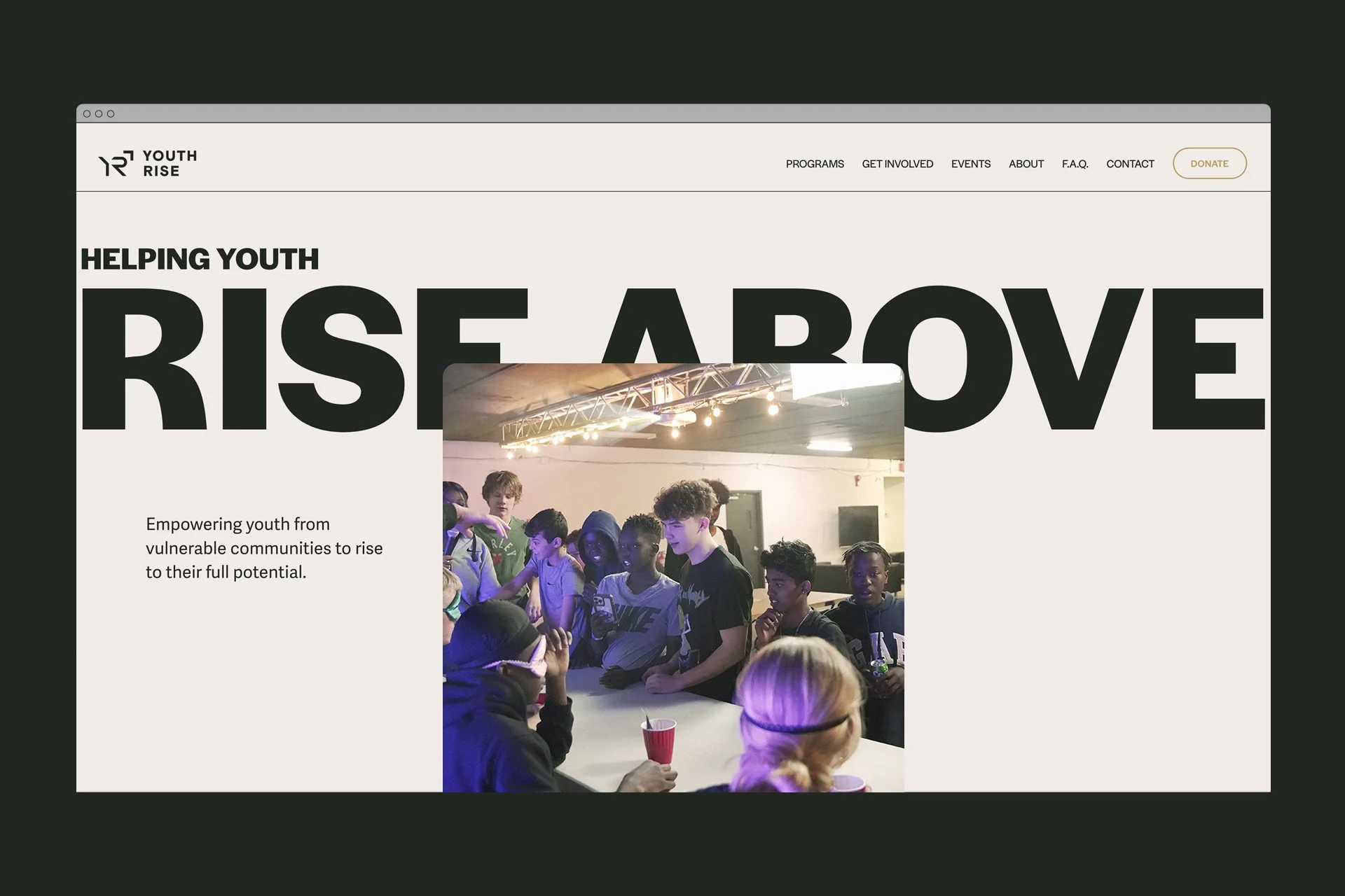
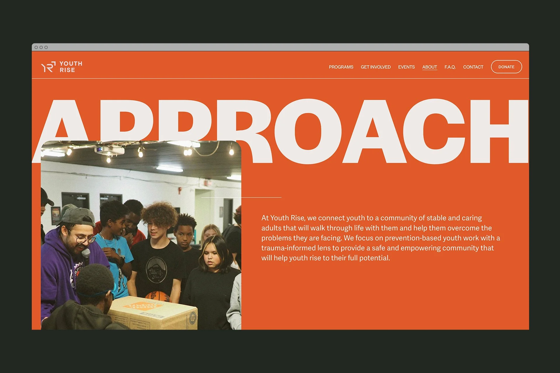
Youth Rise, a newly founded organization in Edmonton, is dedicated to empowering and advocating for marginalized youth. With a variety of programs, such as drop-in centers, sports initiatives, and job readiness training, the visual identity was crafted to capture their comprehensive approach. The aim is to position Youth Rise as an influential youth organization, fostering safe environments for social interaction, promoting physical activity and skill enhancement, and offering guidance for future employment. The visual elements harmoniously reflect this multifaceted nature, establishing Youth Rise as a powerful force in supporting marginalized youth within the community.
SERVICES
Brand Identity
Iconography
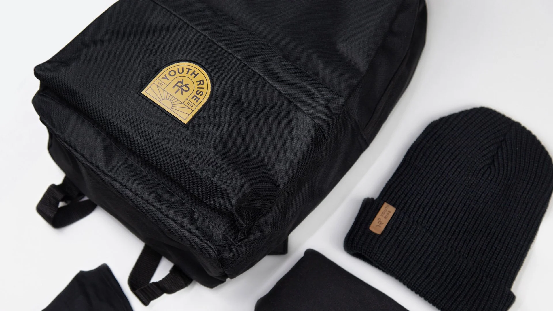
Merch + Apparel
Motion Graphics
Print Collateral
Social Media
Website